
Introduction
In eLearning, good visual design is yet another challenge. As instructors, we want our interactive lessons to look good – but we aren’t trained in layout and graphic design. In many of my own projects, I’ve relied on graphic designers – but often I’ve had to make do with my own limited skills. I’ve learned a couple of things over the years and am happy to share what little I know – more as a starting than an ending point.
Let’s begin with the premise that we want our pages to be visually appealing to students. Of course, more importantly, we want our pages and layouts to support our instructional objectives. We want things to look good and function well. At the very least, we don’t want our design to distract the students or confuse them.
Fortunately, visual design is a combination of art and science. We can draw from a body of knowledge that is evidence-based and not as subjective as we might imagine.
To describe visual design, I can start with the basic concepts of flow, color, style, reading order, consistency, contrast and structure.
When in doubt, simplify
Whenever I’m in any doubt about visual design, I think about the art gallery. In most galleries, the walls don’t compete with the art work. Plain walls. Open spaces. Strategically lit rooms. The labels and interpretive text are positioned so the information is easily associated with the art work. The label doesn’t compete and isn’t crammed. The text is printed in high contrast to the background. I can move easily from piece to piece all around the room and then onto the next. The flow is well thought out.
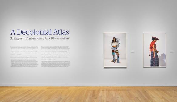
Tufts University Art Gallery
Our interactive lessons can be designed similarly. Text can be cleanly separated from imagery – with an adequate margin between text and image. Margins can provide clean separation of the other page elements. The page background can be selected to not compete or distract from the lesson. The developer can be intentional about guiding the eye from one thing to the next.
Or not
Or sometimes, for effect, we can do the exact opposite. Agitate, provoke, move students out of their comfort zones. But, in either case, visual design requires intentionality.
Visual flow
Screen elements have different visual weights or powers of attraction based on the size, color, and even shape. Unusual things attract the student’s attention.
Instructors should decide where students should look first. If one element is larger than the others, students’ eyes might be drawn there. If all elements are in black and white but there is a splash of color somewhere on the page, the student’s eye will go there. We’ve known these things for some time, but recently, usability labs have provided us with eye tracking sensors, which produce heat maps. Heat maps graphically display how people look at a software screen, for example, and which elements they look at. Areas that attract the most attention appear in hot red.
From usability studies and from age-old observation, we know that visual designs have an entry point. We need to plan or consider where that entry point might be.
We also know that visual designs can have unintended exit points. As an example, hyperlinks can be hugely counterproductive to visual flow control. For good reason, we think of hyperlinked information as being highly useful to students (another resource) but they introduce the risk of students losing the flow, being distracted, perhaps never returning to the lesson.
If our visual design is a simple text page, our job is easier. We can use headings, sub-headings, text wrapped around images as well as size, italics and color to signal very important information. If a page is a free-form layout, we need to plan visual flow more carefully. In that planning, we need to note that the eye is attracted to color, strong contrasts, and follows along thick lines or elements that are composed in a way that suggests directionality.
Color
Color can be used to direct the eye and to attract the student’s eye to key information. Richard Mayer, in his book Multimedia Learning (Cambridge Press, 2001), describes the signaling principle. The signaling principle states that people learn better when cues that highlight the organization of the essential material are added. Instructors can use color to provide that cue, but color-blind students will not benefit. Multiple cues are needed to highlight essential material. Italics for example.
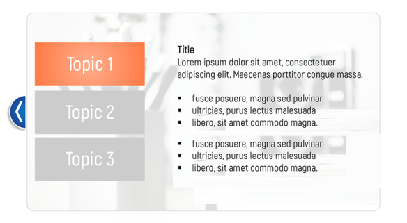
Color used sparingly to draw the eye. Layout created by Clint Clarkson
I’ve always been cautious of the ‘circus’ effect of too many colors. One color will clearly signal important information or draw the student’s attention if s/he is not color blind. Two and three colors can be used effectively. Introducing more colors leans toward a circus effect, where color ceases to attract attention. Graphic design sites describe a 60-30-10 rule, which states that:
The dominant color should be used 60% of the time, your secondary color 30% of the time, and an accent color 10% of the time. Typically, the most dominant color should also remain the least saturated color, while your bold or highly saturated accent color should be saved for your most important content.
http://www.eyequant.com/blog/2013/06/27/capturing-user-attention-with-color
Style
Style may be the most fickle thing to embrace in your visual design approach.
In the early 20th century, graphic designers were influenced by modern art, the Bauhaus school, posters, the De Stijl movement (think Piet Modrian), constructivism, architecture and more. Today graphic designers are as likely to be influenced by styles on the web.
Just a couple of years ago, instructional screens featured gradients, beveled buttons, drop shadows, textured backgrounds and an attempt to imitate the material world in the digital medium. Microsoft and Apple, in the redesign of their graphical user interfaces, reflected the sudden change away from material world imitation. Buttons lost their three-dimensionality and became flat, single-color, texture less features. The new look became, in a sense, minimalist and, perhaps, more functional. The rise in mobile computing favored flat designs over both texture and minute detail as well as other features that didn’t translate well to the small screen smart phone.
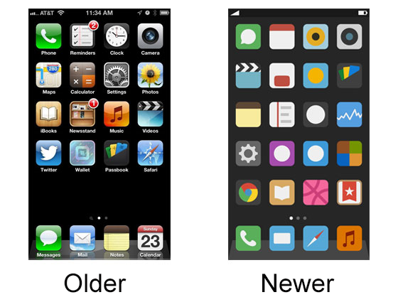
Apple Interface: Shift to a flat design
Flat design is a thing.
“Flat design is a minimalistic design approach that emphasizes usability. It features clean, open space, crisp edges, bright colours and two-dimensional illustrations.” –Tom May, 2018
But styles change. So, what is an instructor to do? My hunch is that we should focus on evidence-based practices and embrace minimalism not for its trendy appeal but for its functionality. We should probably pay attention to the world around us. Pay attention to styles on the web. Pick your favorite website and think about the underlying elements that make it visually appealing and functional. Visit the website of a college of art and design. Follow it over time. But don’t get too hung up on style. It is a black hole. Once you pass the event horizon, you’ll never return to creating anything useful for your students.
Reading Order
Focus instead on some simple things – such as reading order. Highlight important words to ‘signal’ their importance. Use headings and sub-headings to expose the organizational structure of your page and to help students with visual disabilities who rely on a screen reader. (Students with screen readers scan pages by moving from heading to heading. A blind student who used JAWS (popular screen reader) can hit the 1 key to navigate to a level 1 heading to get a sense of the structure and organization of the document. He can hit the 2 key to move to a level 2 heading.
Use bulleted lists and numbered lists where appropriate and reduce the amount of writing. The traditional wisdom was to ‘chunk’ writing by separating it into pages – but mobile devices may be affecting students’ habits. They are accustomed to endless scrolls. More research is needed on the effects of cognitive load of endlessly scrolling pages.
Again, when in doubt, simplicity is preferable.
Consistency
Consistency is key. As students navigate the lesson, they shouldn’t burn brain cells on figuring out each page. Pages that function the same should be styled the same. For example, imagine that your page summarizes key concepts with a bulleted list. Summarizing key concepts is an important strategy. Our pages may dive deeply into the details – but we want students to emerge with a clear map of the key ideas. A bulleted list can be set off to the side of the page (left or right) or placed underneath, separated by space, color, and possibly a border. The placement should be consistent so that students know where to find the summary in each part of the lesson. They’ll look for it.
Contrast
At all times we need a strong contrast between the text and the background. Lack of contrast affects readability. Strong contrast also directs the eye. I break this rule too often when I style hyperlinks to be colored in something other than the standard, boring blue with no decorative underline. And I always regret it. I strive for elegance and create a problem instead.
Some of these key principles relate to work done on perception by the Gestalt psychologists of the early twentieth century. One of their principles, ‘Figure-Ground’ relates to an object and its surroundings. Photographers embrace this principle when they want the subject of a photograph to be clearly known – in other words separation of the subject from the background. Photographers will use a large aperture setting to blur the background (reduced depth of field) and thus create a clear distinction between figure and ground. All elements in the lesson need to be distinct from the background – and that especially applies to text and the background.
Structure
Structure relates to the organization of elements on the screen. It is concerned with proportion, symmetry, asymmetry, and balance. These concepts are expressed in so many ways. In photography, artists may think in terms of the rule of thirds – whether they are following or breaking the rule. Two-thirds land; one-third sky. One-third rocky foreground; two-thirds blurred valley background. Two-thirds of blank space on the left; one-third of birds on the right. Halves, in symmetry has quite a different effect and can be a statement in and of itself. The parliament buildings of London reflected in perfect symmetry in the Thames, for example.
We can make similar decisions with the placement of images on the page. They can be set with a width of 66%, which means that they will always scale to two-thirds of the page, regardless of page size. Or the image can be set to 33% with text wrapping the image and taking up the remaining space. Or they can be wrapped in negative space (e.g. white background) with the ratio of image to negative space a very deliberate choice. Again, photographers might subdivide the plane in a three by three grid, which gives them 9 spaces in which to organize the structural elements of the photograph. Traditional layout artists, similarly, had grids that subdivided the page. Instructors can get a sense of their layout by abstracting the visual elements on the page as shapes. The paragraph becomes a dark block. The negative space becomes a white block. What proportion of the overall space do the blocks occupy? What is their relationship to one another? Are they pleasing and pure? Are they distracting and confusing?
Ratios or proportions reduced to formulas probably doesn’t explain why some layouts are pleasing to the eye and others are not – but it is still interesting to consider the use of math in the pursuit of beauty. The divine proportion or the golden ratio was probably used to plan some of the great pyramids and it is being used evidently today to construct websites. We know that from, again, abstracting web elements into dark and light shapes. The ratio is defined by a simple equation:
a/b = (a+b)/a = 1.6180339887498948420
So, if our text block was denoted by ‘a’ and our image block was denoted by ‘b’, the ratio of text to image would be the same as the ratio of text plus image to text alone. So, the secret to all good learning is in the golden ratio? Not quite. The only point I am making is that the proportion of things will have an effect. We should at least be aware of how things are laid out on the screen. Proportion matters.

Layout created by Lauren Franza
Conclusion
The instructor who consciously and conscientiously includes visual design in the planning of his or her eLearning lesson will reap the reward. Students will benefit from being guided through the lesson, and not being distracted by colors, crammed elements, inconsistency, poor readability, and an off-putting layout. Visual design is a large study – but the application of a few principles will greatly improve one’s eLearning design.
 LodeStar Web Journal