Animation can enrich the learning experience and, when used appropriately, improve learning outcomes. New standards and new technology under the hood of the modern browser give learning experience designers a whole new set of tools and techniques to apply to their designs. I’ll parse out the different types of animations and their uses, discuss the underlying technologies and present examples.
To start, let’s reprise Richard Mayer, the author of Multimedia Learning.
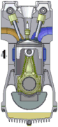
Mayer defines a concise narrated animation. He explains that concise refers to a focus on the essential steps in the process. If the objective is related to understanding how a four-cycle engine works, then a concise animation would include only the details that related to the objective. For example, I might include a simple animation of a piston traveling up and down a cylinder, compressing gas, power stroking from the combustion, exhausting the spent fuel and then refilling with fresh gas.
Wikimedia Commons ((CC BY-SA 3.0)
Concise in this example means that we focus on the crankshaft, the traveling piston, the ignition, the intake and the exhaust. The learner is not distracted by anything not related to the objective
The image above is an animated GIF. Most authoring tools can easily import an animated GIF. This technology, however, has its uses and its limitations. It is difficult to use the animated GIF in a concise narrated animation because it is difficult synchronizing the 4 cycles with the narration. If you understand four-cycle engines, the GIF makes sense. If not, then narration will help learners understand each cycle of the process. Fortunately, there are easy ways to sync animation with narration. This brings us to the timeline animation.
Timeline Animation
The basic idea behind a timeline is that you control animation effects according to time. In tools like Storyline, each row of the timeline represents a different screen element. You can then apply entrance and exit animations to the screen element at specific times.
The timeline in our authoring tool, LodeStar, works differently. LodeStar displays one timeline per graphical element. Each row represents a different property such as left, top, opacity, rotation and scale. With these five properties you can control the position of an element on the x and y axis at a specific time and you can control fade-in and fade-out, rotation and size. These are the properties that designers typically want to animate.
In the screenshot below, you can see that I have two gears. A left gear and a right gear. When I select a gear or choose it from the lower right pull-down menu, I get its corresponding timeline.
As you can see on the timeline, each row represents a different property.

To understand the positioning properties, we need to understand the difference between the SVG image and its sub-elements. We also need to understand other types of images like PNGs, GIFs, and JPEGs. These are called bitmapped or raster graphics because that is precisely what the graphic is: a map of binary digit (bit) values for every colored pixel. The rules for positioning bitmapped graphics and SVG elements differ.
To understand this, let’s first tackle the SVG graphic.
SVG
SVG stands for Scalable Vector Graphics. It is a vector image format that can be scaled up or down without losing any image quality. This is different from the bitmap or raster graphics which are made up of pixels and can become pixelated or blurry when they are resized.
SVG graphics are great for logos, icons, and other types of graphics that need to be scalable and look crisp at any size. They can also be easily edited with text editors or graphic design software, and they support interactivity and animation through script.
We can think of an SVG graphic in two ways: as a whole image or as a collection of elements. Examine the SVG image of an old Buick below. The automobile can be animated from left to right, for example, like any bitmapped graphic.

We can do that with a timeline:

The timeline shows a duration of 5 seconds. At 0 seconds the car’s left property is 1. That means 1% of the width of the window. At 5 seconds, the left value is 100%. This means that the left edge of the graphic will be at the right edge of the window – in other words the car rolls off the screen.
This animation would be less than satisfactory because the tires don’t rotate. So, if we only animated the entire graphic we’d get an inferior result.
That now brings us to SVG elements. Loosely described, these are the sub elements of the SVG graphic. They consist of polygons, lines, rectangles, ellipses, paths, layers, groups, and more. In the screenshot below of LodeStar’s SVG editor, we see that the rear tire is selected. It has a cryptic id, which we can change to an easier name. Whatever the name, this element is both programmatically addressable (meaning we can change it with a simple script) and it is separately animate-able. For example, we can rotate the tire. Now we can move the whole graphic from left to right and rotate two of its sub-elements to improve the animation. (You will see this in an animation sampler introduced in the conclusion.)

Bitmapped Graphics
Bitmapped graphics, also known as raster graphics, are digital images made up of tiny colored squares called pixels. Each pixel represents a small portion of the image and can be assigned a specific color value. Generally, only programs like Photoshop allow us to manipulate bitmapped graphics at the pixel level. Examples of bitmapped graphics are PNGS, JPEGs, and GIFs.
With bitmapped graphics we can animate the entire graphic’s position, opacity, rotation and scale. But we can’t take one of its subparts (a small sub-section of pixels) and independently animate that section. At least, not without sophisticated code. Nevertheless, bitmapped graphics have their advantages. Any photorealistic image is best captured in a bitmapped graphic.
The animate-able properties
In LodeStar, the meaning of left and top differ between SVG graphics and bitmapped graphics. To best explain this, we need to place images in three categories: the entire SVG graphic, an SVG element (sub-element) and bitmapped graphics that are not inside an SVG graphic.
For SVG elements, left means a translation or change along the x axis. 1 means that the graphic has shifted 1 pixel to the right. 100 means that the graphic has shifted 100 pixels to the right.
For images (including JPEGS, PNGS, GIFS and the SVG graphic as a whole), left means the percentage of the window. 0 means that graphic is painted at the very left of the window. 50 means that the graphic is painted half-way across the window on the x axis. The reason for the difference is that LodeStar projects maintain their responsiveness to different devices with different screen widths whenever possible.
Technically, when we reposition an image, we are removing it from its normal place in the HTML document. When we assign a timeline to an image, we are removing it from the HTML flow and assigning it an absolute position.
If you didn’t want to remove the image from the flow (its position in the document), then you can lock the image position in the image dialog.
An absolute position means a position relative to its parent. If its parent is 1000 pixels wide, a left position of 10 places the image 100 pixels to the left of its parent’s left edge. If the image is positioned beyond its parent’s boundaries, it is hidden.
SVG elements are displayed inside a viewbox. We transform the position, scale and rotation of these elements without removing them from the flow. They are painted or shown inside the viewbox. If we shift the position beyond the boundaries of the viewbox, the element is clipped or hidden.
For SVG elements it is important, when adding a left, top or rotate keyframe to also add a keyframe at the same time offset for the other two properties. SVG transformations (change of position and rotation) are defined by all three properties.
Controlling animations with script
LodeStar animations can be controlled by the timeline, as we’ve seen in the example above. They can also be controlled by script or by a combination of timeline and script.
Let’s return to the gears example. In this example there are two SVG elements inside an SVG graphic. In the example, the SVG graphic is not animated at all. However, its elements (the gears) are positioned and rotated. One gear is rotated from 0 to 360, the other gear is rotated from 35 to -325. This causes the gears to rotate in opposite directions at a slight offset from one another so that they mesh.

In the example we also positioned a rectangle with rounded corners at the bottom of the viewbox. We are treating this graphic as a button. We added a branch option to the rectangle, which converts it into a button that responds to clicks.
The branch option that we applied to the rectangle is called a ‘Select Branch Option’. When clicked, the button executes the following script:
appendValue(“rate”, 1);
var rate= getValue(“rate”)
updateAnimation(“1681686408319”, “play”, “”, “”,10, rate);
In this script, we are adding 1 (appending) to a stored value named “rate”. We then get that value from storage and assign it to a variable named ‘rate’. ‘var’ means variable.
In the third line we use the variable in a function called updateAnimation(). This function allows us to
- Identify a page by a page unique identifier called a UID.
- Set the state of the animation: play, pause, or reverse
- Optionally we can set the current time in the animation. By default it starts at 0 seconds. That is why we use “” in the function and don’t bother setting the current time.
- Optionally, we can also state the duration of the animation. By default, the duration is set by the timeline. We therefore use “” in the function. We could shorten or lengthen the duration.
- We set the number of iterations or the number of times the animation repeats.
- Lastly we set the rate. A rate of 1 is standard. A rate of 2 is twice as fast. Every time we click on the button, the animation speeds up. The gears turn faster.

Animation synced with narration
In the next example, graphics are synced to different points in the narration with the use of the timeline.
Modern browsers now offer us fast and efficient animations and audio support with the ability to synchronize the two. This is a significant development in the web platform.
In the example below, the author added a narration and a SVG graphic to the same LodeStar page. In the SVG graphic, the piston, connecting rod, crankshaft, valve, etc. are all SVG elements. As you can see in the screenshot, the crankshaft is selected and shows an ID of ‘crank2’. This helps to identify the element in the animation editor.

After the audio narration was imported and the SVG graphic created, the author launched the animation editor. The play button now plays the audio narration and the animation. The author can pause the narration and add keyframes to control the position of the piston, the position and rotation of the connecting rod and so forth.
The pivot point or anchor point of the connecting rod is changed with the following buttons TL, TR, C, BL, BR. These buttons place the pivot point top-left, top-right, center, bottom-left, and bottom-right respectively. Essentially, we are pinning down the center or a corner so that the rotation happens around this point. Under the hood, we are really changing the transformation origin. The transformation origin is the point around which a transformation such as a rotation is applied.

Finally, once a timeline is created for an element it can be given a unique identifier and applied to any element with script. For example, if I rotated a rectangle with a timeline on one page, I could apply that animation to a triangle on another page — with the use of script. The script function is webAnimate. (See appendix A)
Conclusion
In the sampler linked below, we can see multiple uses of animation. On page one, we see a simple decorative animation of an attitude indicator or artificial horizon used in airplanes. You can easily imagine how this can be applied to a simulation.
One page two, we illustrate how an SVG graphic is moved from left to right while its elements (the tires) are rotated.
On page three is the gear example. Click on the faster button repeatedly to see a demonstration of how we controlled speed programmatically by changing rate..
On page four we have a simple graphic with foreground and background synced to an audio file.
One page five, we can immerse the viewer in a scene with the use of parallax. Parallax is a visual effect where the background of a web page appears to stay still or move in the opposite direction of the foreground.
Finally, on page six we show a narration synced to an animation. Pausing or replaying the narration causes the animation to pause or reset. The narration and animation are synchronized.
(Best viewed in Chrome, Edge, and Safari)
Animation Sampler
https://lodestarlearning.github.io/Animations/index.htm
Author’s Note:
Animations were done in LodeStar 10 (Beta Build 5). Secondly the script for the 4-cycle engine explanation was generated by ChatGPT, and the narration was text-to-speech using Amazon Polly.
Appendix A
webanimate(elementid, timelineid, duration (optional), direction (optional), currentTime (optional), position (optional), callBack (optional))
animates the element’s css properties based on a timeline creating with the animation editor, where id is element ID (no hashtag), timelineid is the id of an existing timeline created in the editor, duration is the length of the animation in seconds, currentTime is where to start the animation in seconds, position is the css position property which is usually set to ‘absolute’ to support top and left movement, and callBack is the name of a page whose branch options will be called when animation finishes.